The curatorial and editorial project for systems, non-
©Copyright Patrick Morrissey and Clive Hancock All rights reserved.
entr’acte : intermission
Galerie Abstract Project, 5 Rue des immeubles industriels, 75011 Paris
8-
Richard Bell, Sharon Hall, Hanz Hancock, Caroline de Lannoy, Patrick Morrissey, Laurence Noga, John Stephens, Kate Terry, G R Thomson, Estelle Thompson.
entr'acte : intermission -
This exhibition, hosted by Abstract Project gallery, Paris (8 -
All make work that is influenced by and intersects, in various ways and degrees, with the histories of Systematic, Constructive and Concrete art.
The exhibition gathers together works in two and three dimensions, featuring different mediums, materials and genres, including paintings, relief constructions and collages. Singularly and severally, these works invite the respondent to join the artists in a process of reading and interpreting a new, defamiliarising grammar of pictorial space, rendered in the concrete materiality of surfaces and colours.
The artists represented are all recognised practitioners in their respective fields. Some were already known to one another through association with The Mercus Barn, Ariège (France) and the online forum Saturation Point (London). Many are showing work together for the first time.
entr’acte : intermission is a Saturation Point intervention, jointly organised by Patrick Morrissey and Richard Bell. Title originated by G R Thomson.
Richard Bell
My painting for this exhibition is one of a number of works which, since the early
1980s, are concerned with how colour relationships are applied to arrive at new aesthetic
outcomes (the ‘presentation’). The material process of colour-
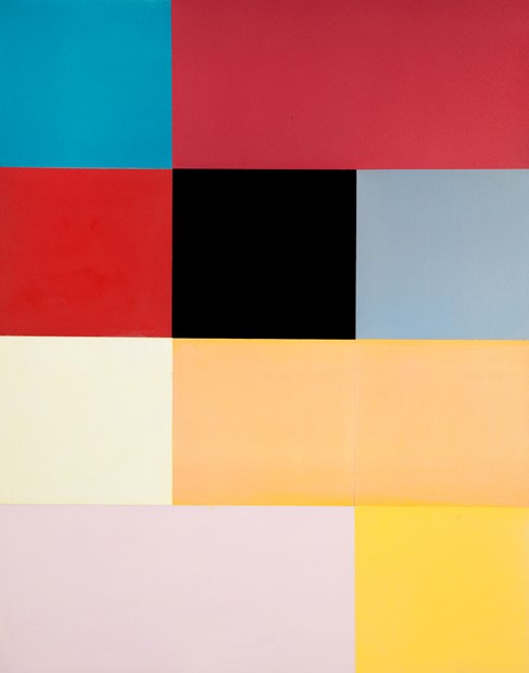
Richard Bell, Painting: Palimpsest 6 (Red-
Sharon Hall
My paintings investigate the different ways in which the properties of colour can be activated through the serial development of geometric permutation, used as a compositional device. These structures act as a vehicle for the presentation of an ensemble of colours, tracking the materiality of stuff through its physical inflection on and within the surface of the painting, and also exploiting colour’s ability to be experienced as ‘live’ through its potential for optical instability.
They reflect my experience of place in both the way the light and shadow may operate within an architectural setting, and also register my interest in embedded colour and certain Italian traditions of fresco and wall painting.

Sharon Hall, Painting in Four Parts (Cadmium Orange, Burnt Umber, Vine Black, Grey), 2016, oil on gesso on wooden panel, 50 x 40 cm
Hanz Hancock
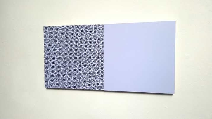
My work is derived from the use of numerical sequences that create a rudimentary
code and which ultimately create variable, mandala-
The picture plane is galvanised into alternating depths, or grounds, depending on the proximity of the viewer. It is febrile in nature, but never typically 'kinetic'.
Structures that form in the close mesh of drawn lines coalesce and dissipate, and are metaphors for the transient nature of geometric form found in the natural and built environment.

Caroline de Lannoy
My work is organised around a few working concepts, including the perception of colour and space, the materialisation of light, systems of proportion, oblique correspondences, fragmentation, disconnects and absences, rhythm, visual vibration, spatial structures, intensity, extension, sequencing, symmetry, asymmetry, distortion, analytic dimensions, reflection, repetition, time, the visible and the invisible.

Kate Terry
Kate Terry’s art practice encompasses sculpture, installation and drawing. Employing utilitarian materials with economy and restraint, she explores the relationships of points, lines, angles, and forms, disrupting our perception of depth, and of shapes and structures in space.
Her sculptures, using painted wood, steel, brass, Perspex and thread, consider concerns of balance, weight and presence with direct emphasis on their physicality, form and colour. These geometric abstractions are reduced to succinct lines and planes of colour, and explore the synergy of abstract and physical spaces by emphasising the points of intersection between forms.

Kate Terry, ‘7523’ 2013. Painted wood and Perspex, 75cm (h) x 23cm (w) x 2.5cm (d)
G R Thomson
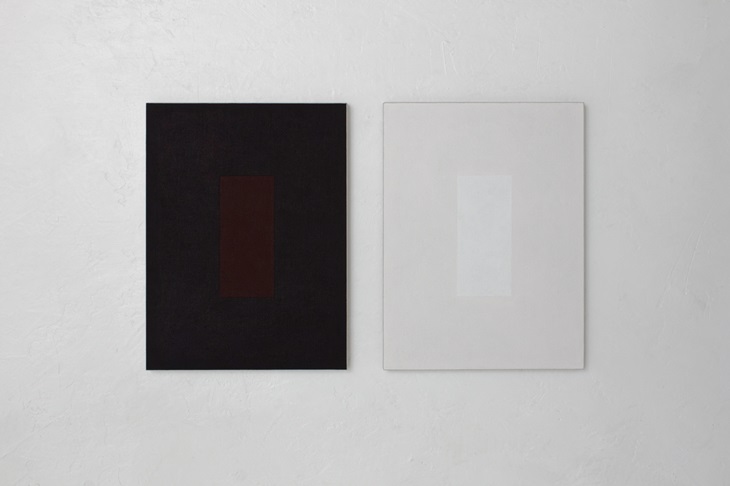
G R Thomson embarked on the ongoing ensemble of split, double paintings that today bear the name “Anachromisms”, in 1983. “Anachromisms”, singularly and severally, make up a sustained meditation, within a materialist framework, on the role played by colour in making and unmaking the possibility of mathematising and formalising the grammar of painting.
This role is necessarily double, forever haunted by an originary splitting that gives
rise to the seemingly contradictory logic of twoness. Twoness overspills, resists
domestication by, enclosure within the simple structural logic of the binary opposition
for which it is often (mis)taken. Thus: two ‘bits’, tableaux, texts, to each numbered
“Anachromism”, hung either side of the uncalculated gap, that re-
Estelle Thompson
Still The Same As Ever (2016) is one of a small series of paintings with virtually identical division and very similar colour. Subtle shifts in distribution, paint surface and luminosity affected the structure, balance and disturbance in each. A particular flesh pink proved impossible to ‘find’ again and drove me on in an unfamiliar way.

Patrick Morrissey
Morrissey employs numerical systems in his work, juxtaposing varying modules to create what has been described as a ‘meandering geometry’. His experimental approach references the philosophical debate about systems, and describes forms that can be found within the natural or constructed environment.
Morrissey’s ontology builds on the late 20th century international modernist tradition,
embracing the grammar of geometry, mathematical systems and methodologies. This results
in an ongoing process-

Laurence Noga
The starting point for my work comes from a system that is operational; each set
of works are developed by assembling hand-
I have been interested for some time in the elongation and compression of an image, particularly in the way in which some systems painters use a more intuitive approach to geometry and the retinal orchestration of space (Michael Kidner, Colin Cina). The multiple views and displacements that occur draw the audience into a peripheral world of imperfect geometries.
Using materials such as acrylic, oil, collage, wood (sometimes steel), powder pigment and enamel, the unpredictability / predictability and pitch of colour arrangements bring into play a contrast with the reductive position of the work. The colour is applied with the aim of disorientating the viewer, often disbursed or used in compartments to create an odd depth of field, challenging the possibility of order and disorder, and building a highly saturated, optically expansive surface.
“Noga uses a systematic process to create his paintings, but the system is interrupted and transformed by the material, uncontainable qualities of paint and physical means by which it is applied” (Charley Peters).

Laurence Noga, Deep Blue Filtered Silver, 2017. Acrylic, collage on panel
John Stephens
As a painter John Stephens works within an abstract idiom, making work in oil paint
on canvas, on paper and more recently as wall constructions, characterised by a pared-

John Stephens: Untitled image for Entr’acte, Paris, 2017

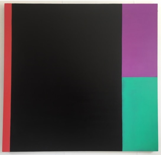
G R Thomson, “Anachromisms” 35 (chromatic blackness) 2013-
http://www.ichroma.co.uk/
