The curatorial and editorial project for systems, non-
Interview with Anna Mossman by Ben Gooding
May 2023
©Copyright Patrick Morrissey and Clive Hancock All rights reserved.
BG
Anna, I first encountered your work some years ago. At the time you were making extraordinary line drawings that were exposed photographically to make a negative image of the original drawing. I think these works pose a number of interesting questions. Let's begin by talking about the dynamic between the drawing and the negative.
If the photographic negative constitutes the ‘final’ work, does that render the original drawing redundant, in the same way that a mould is discarded once a cast is set?
AM
The term ’drawing’ suggests an element of contingency, drawing often being used as a preparation for something else, a way of forming thoughts, planning, communicating an idea. If, as in the case of these works, a drawing is produced solely to be photographed, it may be seen simply as an aid to another, finished form, or alternatively the opposite, as an ‘original’ purporting to be the main event, which is then put aside, displaced by an image that becomes the final form of the work.
Historically, in analogue photography, the negative is a means to an end, that end being a positive print. The negative itself can be seen as a representation or recording of a past event, while also pointing to a future moment (the print that will be made from it), alongside other future moments of presentation and viewing. Similarly, the line drawings can be seen as recording the time and activity that went into their making.

By presenting a negative print as the work itself, that which is seen as purely contingent
process, an incomplete entity, is foregrounded, taking the viewer back to moments
of darkness within the chamber of the camera body, allowing the unseen to be revealed,
the (now) white lines on black being visually reminiscent of an X-
The idea of the mould and cast relates. In the drawings the generating event of their
making (again, a slippery, durational situation to encompass) is now displaced by
a recording that can be reproduced multiple times through printing, like any photograph,
and akin to multiple casts from a mould. However, unusually, the choice of the presentation
of the negative form as the final work heightens the absence of the missing drawing
and situates the work in a more ambiguous position, somewhere along the way in an
unfolding process. The photographer William Henry Fox Talbot coined the term the
‘pencil of nature’, the title of his 1844 book, in relation to the tracing of light
in time onto light-
BG
Yes, I remember being struck by a tension between my perception of time spent, which was implicit in the nature of the drawing, and the instancy of the photographic exposure which, in material terms, constituted the thing I was experiencing in the gallery. The one thing seems to collapse into the other in this ‘unfolding process’ which I think charges the work with a certain frisson.
Conversely, the layering of process detaches these images somewhat from their origination,
rendering them ambiguous, almost as if you are willing (or allowing) the true nature
of their production to become lost, concealed or obscured by technical interventions. As
you mention, they allude to some form of scientific imaging such as x-
Is our understanding of them actually contingent on recognising this aspect of their production? You talk about “removing focus from the ‘thing’ of the drawing”, and I wonder if these objects stand alone as detached entities that do not need to be foregrounded or defined by the physical and material properties of the drawing process? Or if you see them as inextricably bound to the act of drawing and therefore should be understood within the specific context of this tradition? Perhaps they operate more effectively as elusive forms?
AM
I agree that these works possess an immediate presence of their own, pulling the
viewer into an elusive space, transforming the photographed subject radically through
the negative inversion, becoming something new and separate. However, in some way
they remain bound not just to a drawing, but to the mysteries of the photographic
and a supposed representation of our existence in a three-
The photographic work I made leading up to these pieces used the camera for non-
In your question you allude to my ‘willing (or allowing) the true nature of their production to become lost, concealed or obscured by technical interventions’. While there is a history in my work of the hidden, the secret and the obscured, the accompanying titles and information give the viewer clues, suggesting pathways towards a further understanding of the work. However, around 2010 I began to feel that the distance created in the layering of these interventions was starting to be too great, recognising that through the evolution of the work, I was discovering a related intensity in the actual, drawn surface and the presence of the drawn object itself. The transition from analogue to digital photography and the rapid erosion of a range of photographic materials and processes in the early 2000s had actually led to these works, but by now the landscape of the photographic image was so radically transformed that this series of work gradually gave way, and my focus shifted towards the generative object.
BG
The photographic works are indeed enigmatic and I think the way in which they sit in tension between traditions (that of drawing, photographic and even performance) makes them deeply beguiling objects.
Let’s turn, for the moment, to the transition from this layering of technical interventions to the more direct nature of the generative drawings. In your epic works Diagonal Lines and Curved Lines, your starting point is a highly reductive geometric line, one a 45° diagonal line and the other the curve of a circle. From this, an extraordinary structure emerges as you repeat, by hand, each line, allowing imperfection and inconsistency to effect successive lines.

Spiral, 2009, C-
Horizontal Lines, 2006, C-
Diagonal Lines, 2011-
Can you talk about the process of making them? How aware are you of what the lines are doing? Are you consciously informing the progress of a work by directing the lines in a particular way or do you simply allow each line to play out as it does? I can imagine you focusing so intensely on following a particular line that you cease to be aware of, or even in control of, the drawing as a whole, but rather the presence of a moment. Are there moments where you pause to consider how the work is developing and make active decisions about it? Or do you allow these extraordinary structures to emerge uninhibited by thought or intention? Or is there a push and pull between these states?
AM
Diagonal Lines (2011-

Curved Lines, 2012-
When I made Curved Lines I began with a different attitude to the quality or ‘dynamics’
of the drawing, wanting the lines to be as closely packed together as possible, but
still without touching. This quality came from a smaller piece that I had made previously,
Spiral (2009), a negative image work which achieved an intense density within the
drawing. I often take an aspect like this from a previous work that I want to explore
further, to use as a starting point for something new. During the making of Curved
Lines, a few weeks into production, I made a template of the most recently drawn
line (no longer a simple curve, by now an undulating wave) and ‘dropped’ it as though
it had swung downwards, similar to the movement of a pendulum. The drawing continued
from there, leaving what I felt was a much needed space in the work, a relief from
the intensity of the closely packed field of lines, the equivalent to a rest or moment
of silence in music for example. Sometime later I put the drawing away unfinished,
unsure how to proceed. A year or so passed, after which I revisited the work, continuing
it differently, closing the gap and completing the lines across the paper to the
other side. The result was a highly intense field of line which includes powerful
counter-

Curved Lines (detail)
The qualities or dynamics that I refer to partly emerge from my experience in contemporary dance. It could be said that the expanse of the paper equates to the space of the dance studio and the movement within that area relates to the movement of the dancer(s). Simple starting ideas or images are often used in dance improvisation. For example, if ten people move across a space under the instruction to follow a diagonal trajectory, they will all move in slightly different ways, interpreting the instruction through their own, unique body and their particular physicality, the group as a whole creating a dynamic flux across the space of the studio. Similarly, the lines that unfold across the surface to form the drawing as a whole have their particular vibration, somewhat beyond my control, each work acquiring its own unique energy. A student asked me recently if it was “worth it” to make work demanding such long periods of time and effort? I see this extended time as actually contained by or ‘folded’ into the piece and can never predict or imagine the twists, folds and convolutions that will constitute the final intensity of the work, my sense of surprise or revelation on completion being similar to that of any other viewer.
BG
I think this tension between something ‘self-

Diagonal Lines, 2011-
One of the things that becomes apparent on actually seeing these works is the white of the paper that is left between the lines you draw. Indeed, these necessarily become linear forms as well, so you effectively have two linear operations which relate in very interesting ways. While there is consistency in the drawn lines (as the width of the pen nib does not vary), there is a vibrational inconsistency to the negative space between these lines.
This has unexpected optical effects; when one relaxes one’s gaze and ceases to focus on any specific area, the surface seems to pulse or vibrate. Strange waves of patterns or networks appear and disappear, and one even has the sensation of colour. The white of the paper seems to be as consequential as the actual drawn lines!

Line of Lines, 2017, (detail 1)
AM
There certainly is a tension between the self-
I like that you experience tension and tremor within the drawings, and in relation
to that I think aspects of ego-
The combined formation equals the finished work, by now well beyond my control. The optical effects, including the conjuring of colour you notice, situate it somewhere between the perception of the viewer and the paper itself, in a nebulous, fluctuating place, a visual equivalent to the wider ambiguities in status or categorization referred to earlier. That’s when I start to really look at what’s happened and think about the questions it raises for me, to be addressed in the next work, or more usually sometime later, when I look back and something bugs me with enough urgency!
BG
Let’s turn to the Dunkelwald/Twilight Sky series of drawings. They share an interesting characteristic with the ‘Lines’ series, which is to do with how the proximity one has to the drawing changes one’s perception of the work.
From afar, the ‘Lines’ works seem to operate in pure tonal values, like some nebulous
cloud; only on closer inspection does one discern the linear nature of the surface
and how incredibly fine-
They appear at first to be digitally produced, and I suppose in effect some ‘digital’ operations are bound into the methodology, but the highly analogue nature of the drawing lends them a more tactile quality. The texture, or ‘noise’, of the surface is, on close inspection, almost revelatory when one steps back to see the work in its entirety. This oscillation between the two states both fascinates and mesmerises.

Dunkelwaldlight, 2013-
AM
This series uses a hand-
To give some context, the Dunkelwald series consists of three works, the first vertical
in format and quite densely coloured. The second, Dunkelwaldlight (2013-
Twilight Sky (2014-

Dunkelwaldlight (detail)
The oscillation between the different readings experienced in viewing these works includes perceptual shifts, and extends to encompass imaginative spaces suggested through the titles, alongside the visual field. As with the drawings produced as negative prints (discussed at the beginning of this conversation) the works invite the viewer to inhabit an absent or imagined ‘other’ or ‘elsewhere’, pointed to, but not present, in the work before them. In that sense, an assumed field of abstraction also proposes a range of ‘figurative’, imagined content.
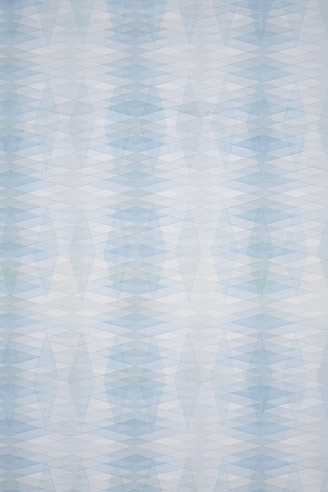
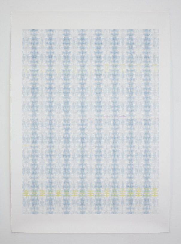
A more recent body of work consists of large works on paper in ink and watercolour,
grouped under the titles Shivers, Shifts and Overlays. These initially stemmed from
Imagined Legacy, a series begun in 2015, following Dunkelwald and Twilight Sky. The
Imagined Legacies works are smaller, coloured pencil is replaced by washes of watercolour,
and the previous grid is rotated and stretched to form diamond-
Bridges at Camon (detail 1)
BG
The Shifts and Overlays series is a remarkable body of work. It’s interesting to note that you mention “printed patterns”, as my own background as a printmaker immediately recognises the language of print present in this work.
The way you have used offsetting and the repetition of motifs to build up a quality
of surface, with each successive overlay adding to the density of colour within the
area of superimposition, is very reminiscent of a printmaker’s approach to image
manipulation, particularly in the silk-
AM
This question regarding my interest in printmaking taps into an aspect of the work
relating to the perception of the viewer. The Imagined Legacies, Shivers, Shifts
and Overlays seem to pose as prints on initial encounter, but reveal themselves over
time, as you point out, to be hand-

Bridges at Camon detail 2
BG
When I first saw these works, I was struck by their subtlety but equally staggered
by the compositional complexity of them and the intricate ‘working-

Terracotta Yellow Shift (detail), watercolour and pencil on paper
Once again, from afar they very much appear to operate as prints, but on closer inspection there is the discernible tactility of the hand, the irregularity of surface, the way the opacity and hue of colour doesn’t repeat exactly as per the pattern, and that particular material quality of watercolour as opposed to the more uniform, flatter feel of ink. They really play with one's perceptions and one is drawn into a state of contemplating them far more keenly than on first inspection.
I’m interested to know how you make decisions regarding colour? It looks as though
the composition is essentially fixed, but the variation in the application of colour
attests to the fact that they are hand-
Bridges at Camon, 2021, 140x198, watercolour and pencil on paper
AG
Your observation of the relationship between structure and colour is pretty accurate,
although the structure also develops during the making. The works are drawn out in
layers, the colour added into each, one at a time, the next layer then decided upon
and drawn out, followed by the colour again and so on. The various combinations of
structure have roots in the Imagined Legacy series, where I played with a range of
simple rotated grids which became more complex as the works evolved. My approach
to colour is intuitive, often starting out with a colour ‘idea’, usually in reference
to something seen, remembered or revisited from another piece. This frequently doesn’t
hold for long; other intuitions quickly enter the field. Really, I respond to what’s
in front of me once I start the work and it leads in unexpected directions, that
being the discovery in the making. I find colour can become overwhelming and I often
backtrack to a default blue/grey which I have worked with since starting the Imagined
Legacy series. My link to this colour originally comes from encountering Scandinavian
hand-

Lime Shift, 2020, (detail_2)
BG
Finally, can you talk about what are you currently working on?
AM
Over the past year I have been developing a new series of large works, Bathers. Horizontal
in format, and over three metres long, these works play with subtle shifts and changes
over the surface, related to movements in water as well as my interest in the complex
interplay between structure and colour in Georges Seurat’s painting Bathers at Asnières
in the National Gallery, London. Most recently I have made an associated video work,
Some Light in the Shadows (Bathers 1) (2023), shown earlier this year alongside the
first painting of this new series in ‘Transfer: Korean and British Abstract Painting
and the Digital Document’ at the Korean Cultural Centre UK. Filmed on a hand-

Bathers (1) 2022, 319x140cm, watercolour and pencil on paper