The curatorial and editorial project for systems, non-
1960s California Hard-
Flowers Gallery, Kingsland Road, London. 5 July – 8 September 2018
Review by John Stephens, August 2018
It makes an interesting proposition for a couple of reasons. The first, and most
obvious one is that it gives us an insight into a specific approach to abstraction,
one that re-
The Abstract Expressionists Barnett Newman and Ad Reinhardt, well-
The context is important, as the use of hard edges in some forms of abstraction in the late ‘50s, early ’60s and beyond enabled artists to use quite uncompromising compositional designs in which, to a large extent, simplicity was key to making unequivocal pictorial statements, usually about colour and how it’s experienced. But it was also about the fact that in the emerging modernist idiom, subject matter became irrelevant, thereby asserting the supremacy of the painting itself. The critic Clement Greenberg championed Noland, and claimed that his use of simple motifs such as circles and lozenges, and his application of paint onto unprimed canvas, with its integration into the weave and thread of the canvas, led to a severance of painting’s links with the past traditions of oil painting and its techniques. Moreover, Noland’s approach, and the nature of his simple compositions, freed the painting from any sense of the primacy of left and right and, importantly, gravity. The paintings could “evoke… limitless space, weightlessness, air…” And it’s important to be aware of these, as characteristic of developments in 1960s abstraction, if we are to read the paintings of Karl Benjamin, Lorser Feitelson and Helen Lundeberg.
That the show gives an insight into what was emerging on the west coast of America
in the early ‘60s is also an obvious point of interest. While we were familiar with
what was happening in New York and Washington, we know less about developments in
California. Indeed, apart from the later emergence of artists such as Richard Diebenkorn,
Wayne Thiebaud, John Baldessari and possibly David Hockney, all associated with California,
I suspect that we have little awareness of Californian art, especially from the late
’50s and early ’60s. By 1960 Karl Benjamin, Lorser Feitelson and Helen Lundeberg
could be considered mature artists. Karl Benjamin was about the same age as Noland,
but Feitelson and Lundeberg were considerably older; 62 and 52 respectively, and
as members in the 1930s of the group ‘Subjective Classicism’, later known as ‘Post
Surrealism’, they had already been involved in artistic alliances -
Although Karl Benjamin, Lorser Feitelson and Helen Lundeberg adopted a hard-
The flatness so typical of modernist hard-
Of the three painters, the youngest, Karl Benjamin, is probably the closest in attitude
to the painters of the East Coast. His work, like that of Noland or Stella, is marked
by the use of simple motifs and shapes such as circles, discs, squares, lozenges
and grids. But rather than use these as single motifs, as Noland did, he combines
them with others, or links them to the framing edge, so that they assume the character
of an emblem or symbol, often alluding to signage or billboards. And unlike the
fluidly-
There’s a strong sense of image and ground, and the painting process that Benjamin uses enhances this. Looking closely at the surface, the oil paint is immaculately applied using carefully placed, single brush strokes, presumably using a wide brush, and brushing over the marking tape, which when removed leaves a pristine edge. The making of the painting has required careful planning: Benjamin has had to take account of which shapes will sit on top of other shapes, and which will be adjacent. Looking closely, you can see how, by using tape, there’s a slight raising at the edges of those shapes that sit on top, and this is absent where they sit adjacent to one another. These are subtleties that require careful scrutiny, but for me they play an important role in understanding something of the history of the making of the paintings and thus how they are read.
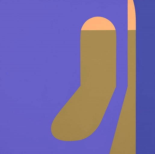
For instance, in ♯37, the dark blue ground behind the two split discs appears to have been painted first, with what becomes the grey ground painted subsequently so that it contains the whole capsule motif, thereby causing an ambiguity of image and ground. The red and pink discs, tonally different, appear to oscillate chromatically, almost like a traffic light.
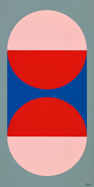
Karl Benjamin ♯37, 1964. Oil on canvas. © Benjamin Artworks, Courtesy of Flowers Gallery, London and Louis Stern Fine Arts, Los Angeles.
♯18 and ♯30 are simpler compositions, consisting of a centrally placed circle in
one and a lozenge shape in the other, and here Benjamin again plays with readings
of image and ground -
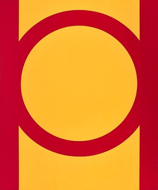
Karl Benjamin ♯18, 1964. Oil on canvas
© Benjamin Artworks, Courtesy of Flowers Gallery, London and Louis Stern Fine Arts, Los Angeles.
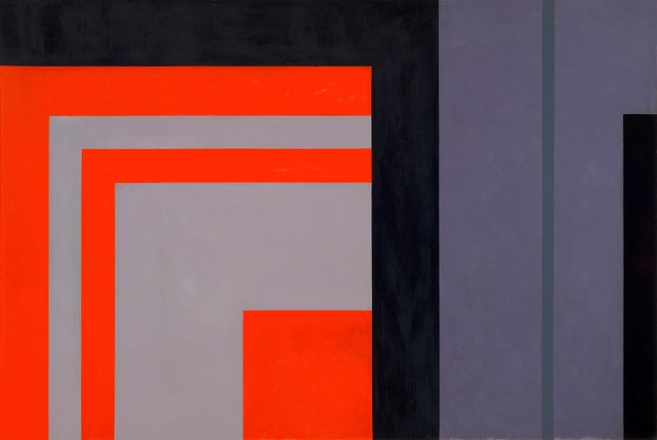
But Benjamin has other approaches to picture making. ♯43 uses a grid device in an interesting way, and of all his paintings in the show, this is probably the most successful and intriguing in terms of presenting us with spatial ambiguities. What can be understood as a blue ground has, placed on it and adjacent to each other, two rectangles, one violet and one green, emphasising the horizontality of the work. Placed symmetrically on top of these are four rectangles; two above two, in each half of the painting, in the same green and violet. And then, placed on top of these are smaller rectangles in the same blue as the ground. Except that these four blue rectangles aren’t actually placed on top at all, although they can be read that way; thanks to the use of masking tape they are in fact revealed as part of the underlying blue ground. In this painting it’s not the jockeying of different hues but a reading of the tonal values of colour that make us question the space. The rectangular elements appear to move back and forth in space, sometimes coming forward, sometimes moving back, sometimes appearing as an opening onto the ground beneath. And yet, because of the sombre green and violet, the work also has a contemplative symmetrical stillness.

Karl Benjamin ♯43, 1964. oil on canvas
© Benjamin Artworks, Courtesy of Flowers Gallery, London and Louis Stern Fine Arts, Los Angeles.
Lorser Feitelson has two different types of painting on display. Although they are
all ostensibly abstract, a closer look seems to reveal an overt connection to architectural
detail, and two paintings appear to allude to aerial views or maps. In both types,
I get a sense that the compositions are sections of something larger. Unlike Benjamin’s
paintings, in which the compositions are contained within the framing edge, Feitelson’s
might well extend beyond the edges. They are marked by a series of subdivisions,
which might be traceable back to the paintings he made in his post-
Untitled, Magical Space Forms, a painting in landscape format, is divided simply
into two sections; the left-
Lorser Feitelson Untitled, Magical Space Forms, 1960. Oil on canvas
© The FeitelsonLundeberg Art Foundation, Courtesy of Flowers Gallery, London and Louis Stern Fine Arts, Los Angeles.
There’s a similar approach to compositional organisation in Untitled, 1960. Again,
the canvas is divided into a square and a ‘what’s left’, but this time it’s reversed.
The right hand assumes the role of the square and the left-
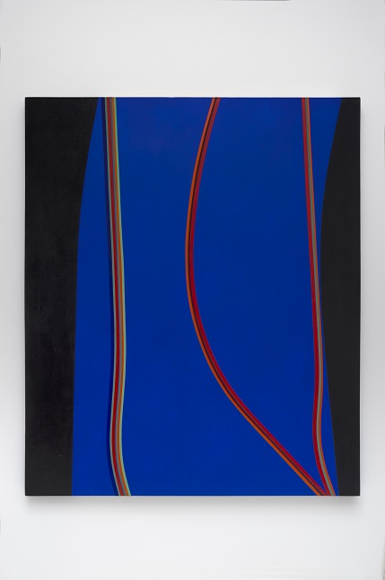
Feitelson’s other type of painting is evident in Untitled 1964 and Untitled (February10) 1965. These paintings were made five years after the previous two, accounting for the significant stylistic difference. They both consist of linear elements running in a meandering flow from top to bottom. In Untitled (February10) 1965 they run over a ground of silver paint laid over previous painting of similarly meandering shapes, while in Untitled 1964 the lines are on a blue ground and appear to be hemmed in by two waving black edges. As in the two previous paintings, the effect of the lines running from top to bottom is to suggest that the painting could extend beyond its framing edge, as if the painting is derived from an aerial view or map. But the viewer, once divested of this notion, is animated by the fluid lyricism of this work. The surface of the painting reveals the sequence of its making; the lines are laid on last, between edges of masking tape, so that the ‘tracks’ are almost in relief. Although these two paintings have lost any allusion to a ‘design palette’ it is nevertheless difficult to understand the colour intentions of the artist. The use of silver paint may have some sort of reference to its use by the Pop artists of the time, notably Andy Warhol.

Lorser Feitelson Untitled, 1964. Oil and enamel on canvas.
© The Feitelson/Lundeberg Art Foundation, Courtesy of Flowers Gallery, London and Louis Stern Fine Arts, Los Angeles.
Helen Lundeberg’s abstract paintings have inherited her rather beautiful handling
of paint, use of subtle colour, and the meticulous drawing of her post-
Helen Lundeberg, Untitled, July, 1964. Acrylic on canvas. © The Feitelson/ Lundeberg Art Foundation, Courtesy of Flowers Gallery, London and Louis Stern Fine Arts, Los Angeles.
Lundeberg comes closest to real abstraction in Untitled 1969. This is an asymmetric
composition with two capsule-
Helen Lundeberg, Untitled, July, 1969, Acrylic on canvas. © The Feitelson/Lundeberg Art Foundation, Courtesy of Flowers Gallery, London and Louis Stern Fine Arts, Los Angeles.
As I’ve already mentioned, this show represents an interesting curatorial enterprise,
bringing to light the work of artists that might not otherwise be seen in this country.
Indeed, the critic Hunter Drohojowska-
But I think the show has wider significance than this. The achievements of the artists
based in New York and Washington who became known as the ‘Colour Field’ painters,
so much championed by the critic Clement Greenberg, left other artists wondering
where to go from there. In New York artists embraced Minimalism and then Post-
https://www.louissternfinearts.com/
The summer months -

Lorser Feitelson, Untitled (February 10), 1965, oil on canvas ® The Feitelson Lundeberg Art Foundation, Courtesy of Flowers Gallery, London and Louis Stern Fine Arts, Los Angeles
©Copyright Patrick Morrissey and Clive Hancock All rights reserved.
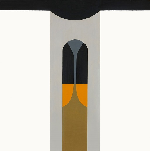
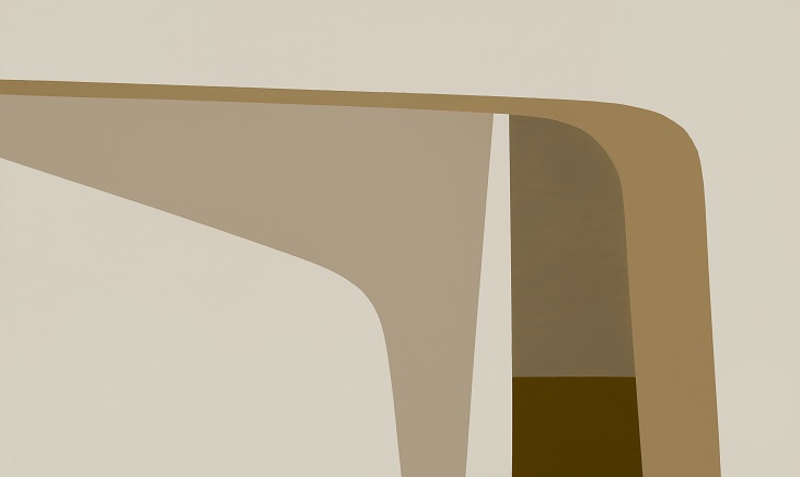
Untitled (Arches II) is a painting in browns and beiges that at first sight appears abstract, but in fact subtly denotes a stylised depiction of shadows cast by one architectural element onto another with deep space beyond. And while one could argue that the artist has abstracted from something seen, it is nevertheless difficult to read it as abstract. The paint is meticulously applied so that no shape or plane is raised above another; they are all adjacent to each other. This is not a painting about colour; the colour is used as local colour to describe a sense of light and atmosphere, rather like an old sepia photograph, and this is its charm.
A similar quality of light and space can be seen in Untitled, July, 1964, a symmetrical
painting made with a limited range of tonally related colours with just two small
flashes of orange. Again, this is a painting that depends on an abstraction of shapes:
something seen and translated into a stylised rendering. The apse-
Helen Lundeberg, Untitled (Arches II), 1962, oil on canvas ® The Feitelson Lundeberg Art Foundation, Courtesy of Flowers Gallery, London and Louis Stern Fine Arts, Los Angeles
Installation view of 1960s California Hard-