The curatorial and editorial project for systems, non-
Michael Kidner | From Rothko to Riley
Flowers, Cork St, London, 30 April -
A review by Laurence Noga
©Copyright Patrick Morrissey and Clive Hancock All rights reserved.
In this intimate and compelling exhibition Michael Kidner’s transformative approach
builds connectivity between Mark Rothko’s softly articulated geometry and the optically
complex combinations in Bridget Riley’s hard-
“It is the area between the second and the third dimension which interests me – the order that lies between imagination and reality. Reality involves experience.” Michael Kidner
A parallel notion of enquiry exists in Kidner’s painting. Firstly, through his visceral
and psychological understanding of colour, both in the tonal adjustments, and the
sense of movement thoughout the gallery. And secondly, by using his research into
retinal after-

Raindrops (1960), Oil on canvas, 97 x 122 cm
After-

Homage to Rothko (1956). Oil and gouache on paper, 50.8 x 38.2 cm
An interplay of warm and cool tones in Homage to Rothko builds on that after-
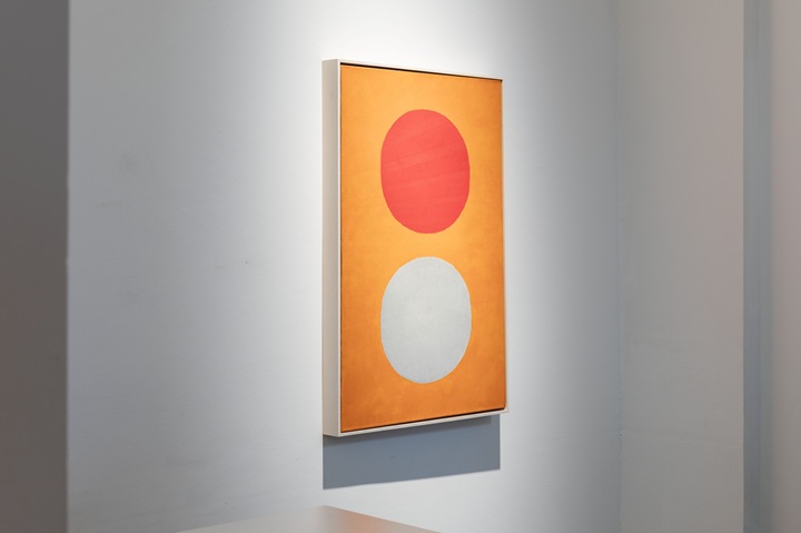
Untitled (Colour Balance with Red, White and Orange),1957. Oil on canvas, 92 x 61 cm
Playing with scale feels critical for Kidner. It has an impact in all the works, but in his hands we feel he is examining perception and space. He uses the dispersion of colour in that vision, but through a highly contemporary lens. The low light in the space emphasises the emotional resonance that Kidner draws out from the audience. Untitled (Colour Balance with Red, White and Orange) has a calculated chromatic sequence and emits its own kind of energy. Perhaps he is talking about a system of colour which indicates a glimmer of hope concerning atmospheric conditions, the colour transcending our experience. I like the way the registration of red, orange and white has an intensity that brings to mind Rothko’s No 22 (1949) in the way the light pulsates, as if from a screen source.
Right: Untitled (c.1960). Oil on linen 101 x 121.5 cm, Second from right: After Image (c. 1960). Oil on linen, 96.5 x 122 cm
After Image (1960) has an eye-
Untitled (1960) is a stunning and original work that allows Kidner to find his own
unique twist of colour combinations and colour contrast. He carefully constructs
a retinal image that makes us aware of the hidden arc glimpsed beneath the transparent
white surface like a geometric apparition. The chromium oxide green ground is bisected
by creamy-


Violet Ochre & Blue Stripes (c.1963), Oil on linen, 126 x 76 cm
In Violet Ochre and Blue Stripes (1963) Kidner sharpens that relationship, perhaps finding inspiration in Riley’s animated visual language of repetition, symmetry, and asymmetry. Kidner’s structural system of displaced parallels is here combined with Rothko’s colour palette. The depth of space is fractured by the angularity of the vertical strips, calling to mind Bridget Riley’s Shift (1963). Kidner makes painterly decisions, while incorporating systems artists. I am immediately intrigued by the way in which he has left the vertical strips with broken edges to increase the fluttering sense of movement, tightening up the composition, moving towards a generative mechanism.

Butterfly Wings (1966), Oil on canvas, 168 x 183 cm
The striking, intricate wave patterns in Butterfly Wings (1966) are structurally
difficult to unpack. We start to speculate how the work began. Kidner’s colour distribution
operates like pockets of air, perhaps suggesting how butterflies respond to temperature. Like
stepping stones, the composition is divided into columns. By the fourth column of
grey/turquoise, the saturated colour has altered to a cadmium yellow /turquoise relationship.
In contrast, the second column shifts from a pink/yellow to pink-
It’s possible that Kidner was aiming to elevate our understanding of the natural world by regulating the temperature of his colour choices. It may be that he is indicating the distribution of the colours to emphasise the rapid lifecycle of the butterfly. A butterfly’s four wings are used to impress a mate, and Kidner certainly pulls us in close, constructing a composition through time and memory, in a hierarchy of system and procedure.

Untitled (Orange, Magenta, Brown) (1963). Acrylic on canvas, 220 x 158 cm
Untitled (Orange, Magenta, Brown) (1963) brings together the kind of scale and spatial
relationships that we find exhilarating in both Rothko and Riley. Its resonance and
luminosity, combined with the optical elements make a fantastic combination. Highlighting
a visual sense of compression in the composition, Kidner develops an optical illusion
in the stretching of the elongated horizontal bands. But it is the placing of Column
II (1970) alongside this painting that makes us aware of Kidner’s logic, or systematic
interpretation, of a two-
I like the way Kidner uses a recurrent sense of interference, visibly interwoven into the structure of his paintings. His examination of visual disturbances that activate a momentum in the work feels important. But perhaps it is his relationship between two wave surfaces into a relationship with each other that is at the core of his practice. He is articulating strategies within a visual puzzle that the viewer must attempt to disentangle.
All photos courtesy of Install, Michael Kidner: from Rothko to Riley, 2025, Flowers Gallery, © the artist. Photography by Antonio Parente.